-
backgrounds and CSS
Date: 04/30/07 (Web Development) Keywords: web
Hello all, I am having a problem implementing part of my design. The novelty of the design is that there is a subtle background on which translucent tables with information appear. I seem to be having difficulty laying out the background in a suitable fashion. Here are some images that might help you better understand.
This is a scaled-down image of the background I would like:
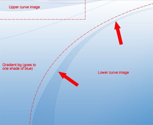
Basically, I want there to be a background gradient that goes down to a solid color after some time. Besides that repeat background gradient I also have the upper curves image and the lower-right curves image:
I'd like the lower and upper curves to remain in their sports regardless of screen size.
I heard someone mention something to me about the z-coordinate, so I guess layering the items in that fashion. Do any of you have experience "layering" image items to create your backgrounds or other visual web elements? In the past I have created a class that repeated the background image and fixed it to the top, repeating only in the x-direction for a gradient background, but what about this kind of scenario? Thanks for all help in advance!
| « FTP help | || | vertical alignment with CSS » |